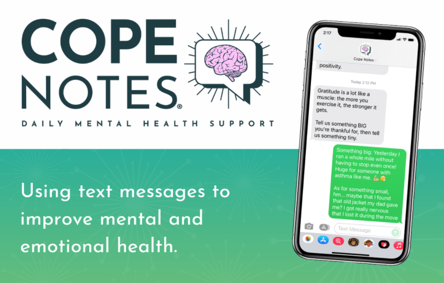
Redesign: Trial to Paid Conversion Optimization
A focused 8-week design sprint to fix a user journey from free trial to paid subscription. Through strategic UX improvements and data-driven design decisions, I tweaked key touchpoints in the conversion funnel to reduce friction and better communicate value.
Key Challenges
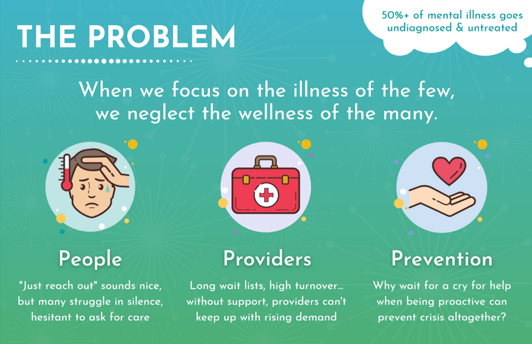
Problem: Despite strong initial user engagement during the free trial period, the platform struggled with low conversion rates to paid subscriptions. This created a dual problem: users weren't accessing the support they needed, and the business couldn't sustain its mission to provide accessible mental healthcare.
So what was happening?
- Poor timing of conversion prompts within the user experience
- Unclear value proposition communicating the benefits of premium features
- Friction points in the subscription flow that deterred conversions
- Misaligned messaging that didn't resonate with users' mental health journey
Design Opportunity:
How might we redesign the overall user experience to better support peoples' mental health journey while improving subscription rates, ensuring that business success directly correlates with better user outcomes?
Research and Discovery
My Approach
I took a comprehensive, data-driven approach to understand why users weren't converting from free trials to paid subscriptions.
This involved collaborating across teams to gather both quantitative and qualitative insights, then translating those findings
into concrete design improvements.
The Solution
Rather than making assumptions, I systematically identified and addressed the root causes of conversion friction. By analyzing user behavior data
and conducting targeted research, I developed strategic improvements that streamlined the trial-to-subscription experience while better
communicating the platform's value to users seeking mental health support.
Key Insights
The focus was on creating a conversion experience that felt natural and supportive, rather than pushy or
sales-driven, which was crucial for users in a vulnerable mental health context.
Data Analysis
To build a foundation for design decisions, I analyzed existing user behavior data using tools like Google Analytics, Metabase, and Hotjar across both desktop and mobile platforms. This comprehensive data review revealed key insights into trial usage patterns, bounce rates, user flows, and heat maps, helping me identify exactly where users were dropping off in the conversion funnel and what might be causing those friction points.
Stakeholder Interviews
I conducted a group interview with the founder, project manager, and engineering team to align on critical business concerns.
The leadership team identified five key issues: declining conversion rates below industry benchmarks, negative product reviews affecting brand perception, poor user engagement indicating low product-market fit, decreased site traffic, and extremely high landing page bounce rates preventing trial signups.
This stakeholder input helped prioritize which conversion barriers to tackle first and ensured my research would address the most business-critical pain points.
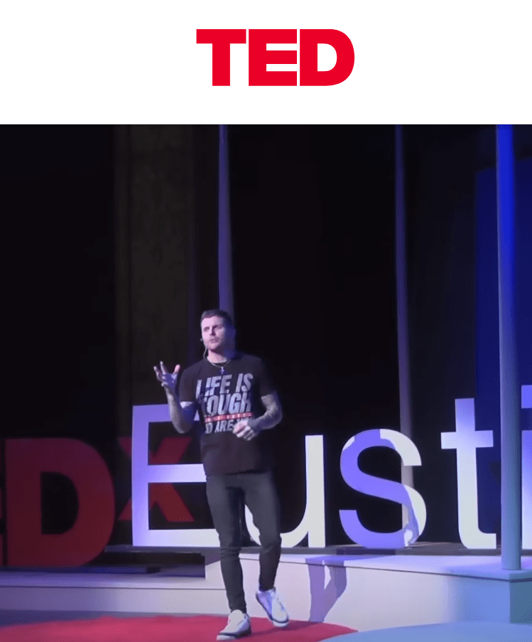
Founder Johhny Crowder Giving a TED Talk
Initial User Interviews
I designed a structured user interview series to understand how users interact with and perceive the Cope Notes platform, focusing on identifying specific friction points in their trial-to-subscription journey.
Total Participants
10 - Four Males and Six Females
Interview Duration
20 - 30 Minutes
Meeting Location
We met in person at the Cope Notes office
The goal was to get participants onboarded and record their real-time feedback and insights as they navigated the platform for the first time. This approach allowed me to capture authentic user reactions, understand their decision-making process during the trial experience, and identify exactly where and why users were dropping off before converting to paid subscriptions.
Initial Findings
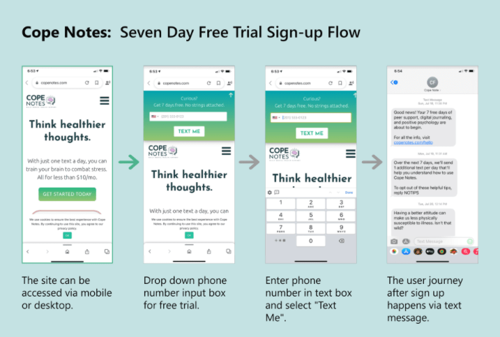
- All users were able to successfully sign-up for the seven day free trial
- 2/10 participants commented on the site looking loud or spammy
- 7/10 participants expressed excitement about the features listed on the website
- 3/10 participants stated they were unsure of what the service was or how it worke
- 4/10 participants expressed discomfort when asked to provide their cellphone number to the website
Followup User Interviews
Since Cope Notes offers a seven-day free trial for a mental boost, I scheduled follow-up interviews on the last day to capture user sentiment before and after their experience. This timing was critical for understanding how users' perceptions changed throughout the trial period and what factors influenced their decision to convert or abandon the service at the crucial conversion moment.
Total Participants
10 - Four Males and Six Females
Interview Duration
20 - 30 Minutes
Meeting Location
Conducted Remotely over Zoom
The goal was to get participants onboarded and record their real-time feedback and insights as they navigated the platform for the first time. This approach allowed me to capture authentic user reactions, understand their decision-making process during the trial experience, and identify exactly where and why users were dropping off before converting to paid subscriptions.
Affinity Mapping
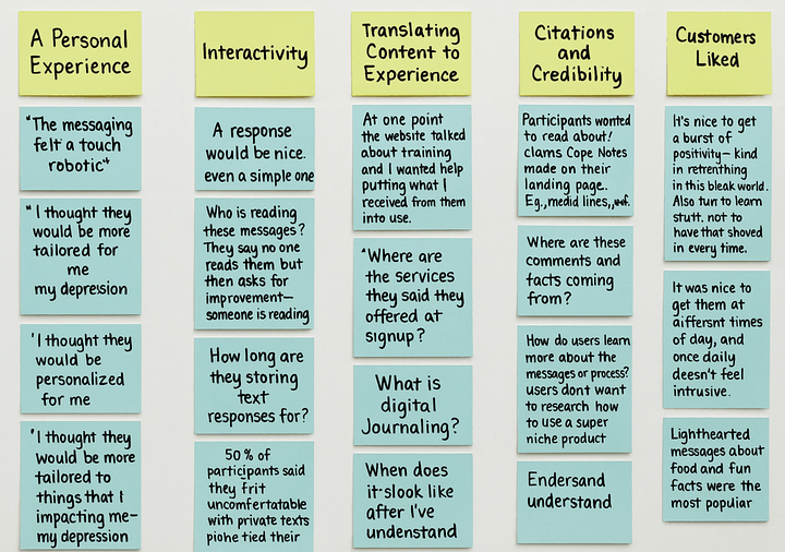
The follow-up interviews revealed four critical themes impacting conversion: personalization, interactivity, content connection, and credibility. Users wanted content tailored to their specific needs, engaging experiences beyond passive consumption, emotional relevance to their personal journey, and trustworthy design and messaging. These insights showed that improving conversion required delivering meaningful value during the trial, not just reducing signup friction.
User Engagement Findings
My analysis revealed three critical areas undermining conversion performance.
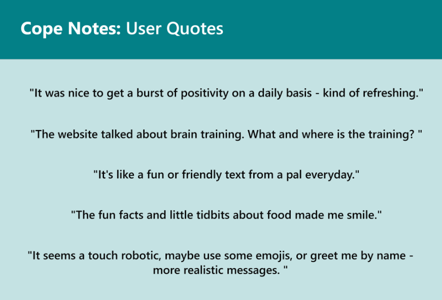
Messaging inconsistencies created user confusion, with participants describing communications as robotic and overly promotional. Users appreciated engaging content like "fun facts" but found frequent requests for deliverables burdensome, leading to platform disengagement.
Interaction design gaps showed that calls-to-action lacked clarity and failed to provide users with substantive value that matched the promises made during acquisition.
Personalization deficits were particularly damaging to conversion, as users perceived the experience as generic and couldn't justify the pricing for what felt like a one-size-fits-all solution rather than tailored mental health support.
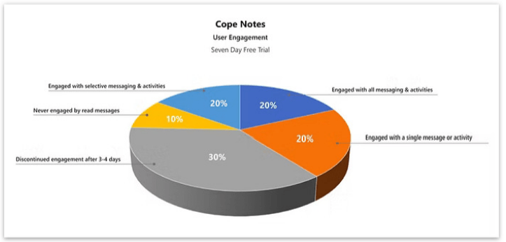
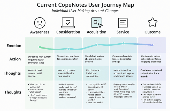
Diagram the User Journey
I used journey mapping to systematically highlight user actions, pain points, and engagement opportunities throughout the trial-to-subscription flow.
This comprehensive mapping exercise provided crucial guidance for future UI designers by documenting user expectations at each touchpoint and identifying the most effective motivational strategies to drive conversion.
The journey map became a strategic foundation for understanding where users experienced friction and where we had opportunities to deliver meaningful value that would encourage subscription commitment.
Optimization
Recommendations
To boost conversions from the free trial to paid subscriptions, I identified three focus areas: Messaging, Site Interaction, and User Experience. I developed detailed recommendations for each, along with a forward-looking UX/UI improvement plan.
Avoid exclusionary or triggering messaging, focus on fun and facts, and avoid homework or "asks." Ensure promised services on the homepage are delivered.
Standardize the CTA, clearly link people to value, and gather more data to create targeted message campaigns.
Personalize and humanize the content, add depth with sources and citations, and enable two-way interactions.
Collaboration and Implementation
Based on these findings, I collaborated with the founder and engineering team to implement targeted solutions across all three areas.
We redesigned messaging to be more supportive and engaging while ensuring homepage promises matched actual platform capabilities.
The team standardized call-to-action patterns and implemented clearer value connections for each user interaction.
We developed personalization frameworks that humanized content delivery and enabled meaningful two-way user engagement.
These coordinated improvements directly addressed the core conversion barriers identified through research, creating a more trustworthy and valuable trial experience that better supported users' mental health journeys while driving subscription growth.
Reflection & Impact
The goal was to understand the user journey during the Cope Notes free trial and identify areas for improvement. This 8-week sprint demonstrated how strategic UX research and thoughtful product designcan directly drive business outcomes while maintaining ethical standards in mental healthcare:
- Mixed-methods research provided comprehensive insights that single approaches would have missed
- Credibility and personalization were critical factors affecting users' willingness to pay for mental healthcare
- Inconsistency between homepage promises and platform delivery created immediate user distrust
- Cross-functional collaboration ensured research insights and design updates translated into meaningful product improvements
"In mental healthcare, trust-building through consistent value messaging and personalization drives conversions more effectively than traditional funnel optimization."
Key Project Reflection