
Design Sprint 2020
Gallery Pal
Creating a Digital Museum Companion
In a 7 day Google Ventures-style sprint, I designed an art gallery companion app to enhance museum visitors' experience.
Problem
Many visitors reported feeling disconnected and struggled to connect context, background, and appreciation for art.
Solution
Gallery Pal: a digital guide and interactive map with curated paths and info on each artwork.
Role
Mapped, sketched, prototyped, and tested an app to create a more engaging in-person gallery experience.
(1).png)
Understanding the User
After reviewing the problem space and provided user insights, I created a quick persona outline to stay aligned with user motivations and challenges.
*The ability to empathize and understand my users pains and gains helps to create a product that allows users to achieve their goals.

Journey Mapping
User needs and personas guided each step of the journey mapping process from admission to departure. Frequent user feedback about missing, relevant info on art pieces informed the ideal experience design.
Gallery visitors often arrive with little information and seek to learn more about the artwork on display.
Museum-goers often rely on quick Google searches for limited context on the art they’re viewing.
People are interested in provenance and would appreciate learning about the artist’s techniques or hearing expert insights.


*My notes from a brain storming session focused on outlining the user journey
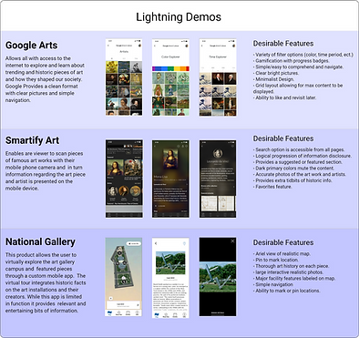
Lightning Demos
Secondary research into paintings, sculpture, and portraiture revealed new tools and insights, helping to shape a clearer market picture. I reviewed a dozen products and drew design inspiration from three key examples.
Crafting Solutions - Sketches

Crazy Eight brainstorming activity helped generate and refine ideas, features, and concepts to shape a cohesive, clear interface.
*I often use this technique in group setting to help generate a variety of solutions in a short amount of time and all can be heard / contribute.
Quick Sketches and Flow
A three-frame sketch outlines the main screens:
-
Map
-
Art Piece
-
Artist Info.
The interactive map reveals details about the artwork’s background, techniques, and the era it was created in.

Storyboarding
Sketches of a guided experience led to a map-like format, where the map guides users through a cohesive art journey. This educational approach offers insights into the artist, techniques, history, and key influences of the time.
*Creating a storyboard helped visualize the most important elements on each screen.

High Fidelity Mock-ups

High-fidelity mock-ups were created quickly, with navigation focusing on easy access to the homepage, scan feature, and map. The design remained clean and modest, aiming for a distinguished look while staying true to brand colors.
Prototyping & Animation

A high-fidelity prototype was created to showcase designated reroutes, demonstrating flow and function. Progressive disclosure guides users through engaging historical facts about the art and its creator.
Usability Testing
After planning the research session, usability testing began. A key takeaway was that users wanted to explore everything, highlighting the need for deeper navigation in the final design.
“It's fun! What a nice guide to have during a museum visit.”
S. Woods
“The pictures provide a great indicator that I'm reading about the right piece”
N. Yang
“I like the context that the artists background provides.”
K. Stevenson
Findings
-
Test findings indicated that a larger more interactive map would be more user friendly.
-
All users successfully navigated the prototyped reroutes, offering insights into areas to refine, enhance, or potentially remove.
Reflection & Future Steps
The Gallery Pal concept offers a strong foundation for a gallery companion app, though it still requires further information architecture, user testing, and screen iterations.
Creating this quickly was an exciting challenge, and I enjoyed designing a product to make culture more accessible and connect people with art. Next steps include additional high-fidelity screens, usability testing, user interviews, and refining the information architecture and reroutes.
