Updating a B2C Mobile Retail Portal
When Colorado retailer Relic Bicycles lost their physical store to Covid-19, they needed to quickly pivot online. I helped them transform poor mobile conversion rates into a streamlined digital experience through systematic user research, product design and accessibility testing.
Key Challenges
Problem: Marketing brings in adequate traffic, but product views, time on page, click-through rates, and completed purchases all fell short of projections.
So what was happening?
- Users loaded up carts but abandoned them at checkout
- A complex and outdated interface created massive friction
- Poor information architecture sent users bouncing after search
- Low return rates due to trust issues and a broken mobile experience
High Cart Abandonment
Users were adding items to cart but not completing purchases, particularly on mobile devices
Poor Mobile Engagement
Low page time and click-through rates despite successful traffic acquisition
Conversion Gap
Significant disconnect between visitor numbers and actual sales completion
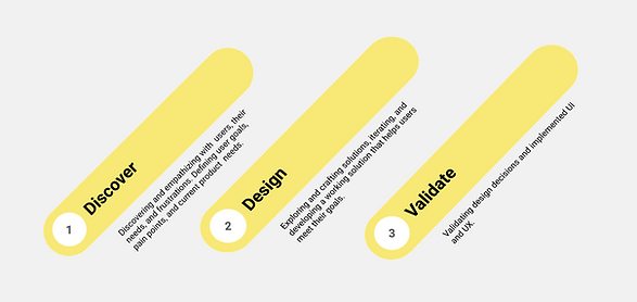
User Centric Process
Discover
Insights from user interviews and performing market research.
Define
Empathy maps, user journeys, personas, problem statements, and success metrics.
Develop
Ideation, prototyping, wireframes, design artifacts, testing, and collaboration.
Deliver
Usability testing, high fidelity designs, A/B testing and optimization, handoffs.
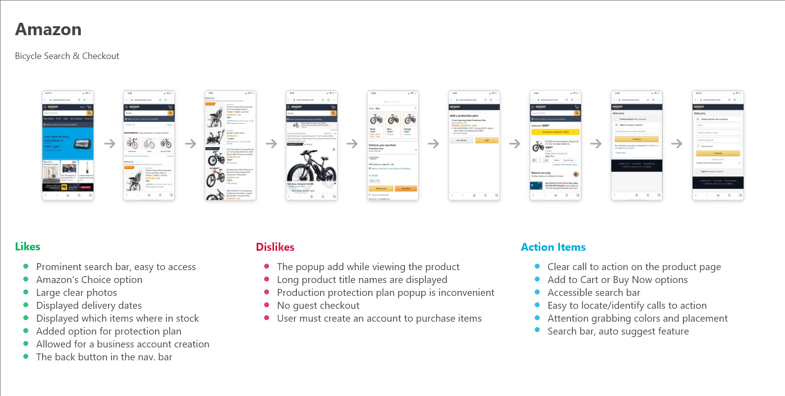
Industry Analysis
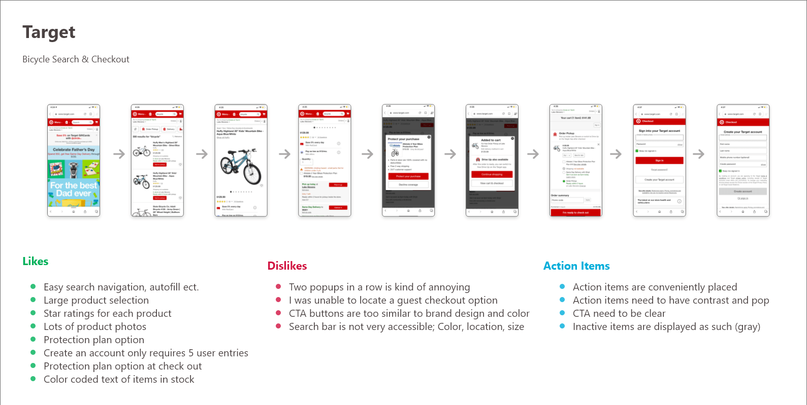
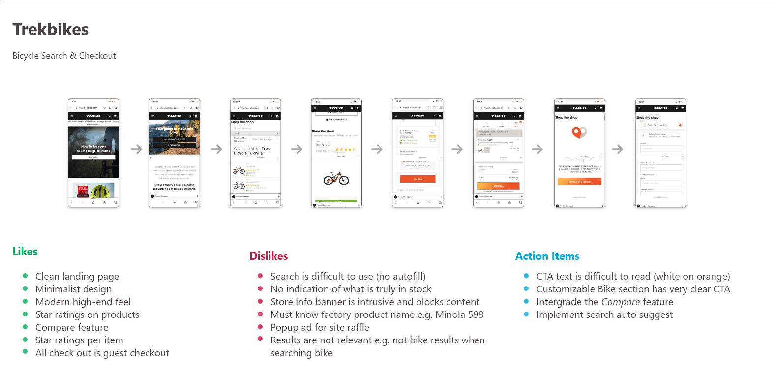
I started by diving into the competitive landscape by researching bike retailers, analyzing top outdoor brands' eCommerce strategies, and understanding what made certain retailers stand out both online and in physical stores.
1:1 User Interviews
Research
I interviewed dozens of customers to understand their experience and core needs when buying bikes
Interview Method
Due to COVID restrictions, I conducted remote interviews with potential customers via video calls, using screen-sharing to observe
their online shopping behavior in real-time.
Key Insights
For high-end mountain bikes, customers prioritize extensive research, brand trust, and long-term value over quick purchasing decisions.
The buying process is methodical and relationship-driven, it's a significant investment and they need confidence in the product and the retailer.
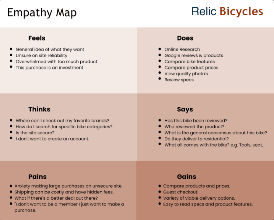
Empathy Mapping
With the physical store closed due to COVID, my research and competitive analysis revealed how customers' needs shifted to online purchasing. I created empathy maps to synthesize user motivations and the heightened concerns around buying expensive bikes sight-unseen, identifying specific opportunities to improve trust, product confidence, and the digital purchase experience.
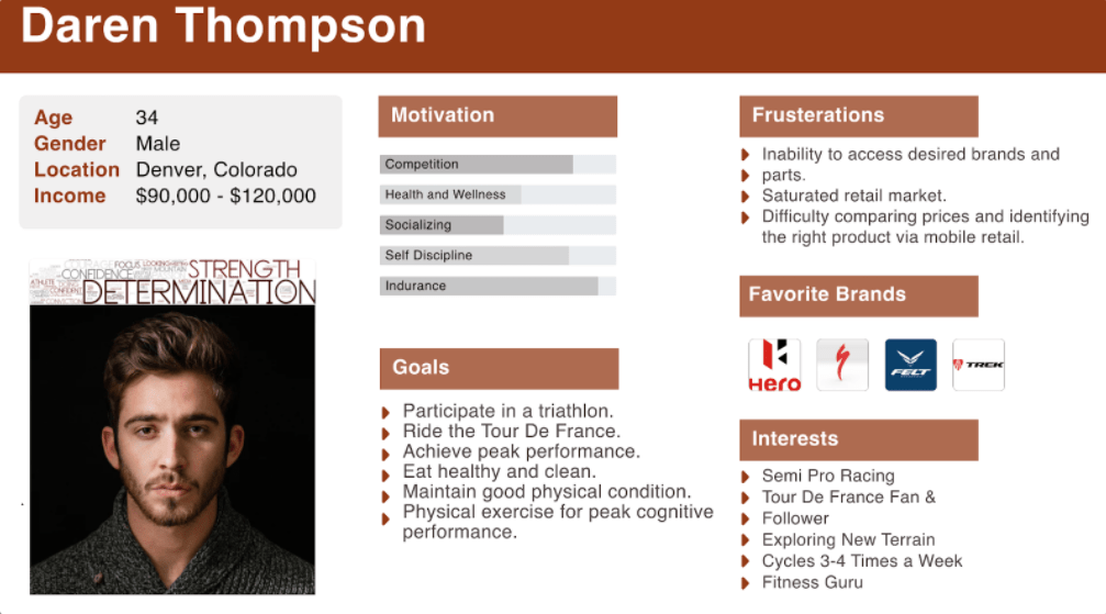
Creating User Personas
Building on my interviews and competitive analysis, I developed user personas that captured the distinct needs of mountain bike buyers (from weekend warriors to serious enthusiasts). These personas helped prioritize features and guide design decisions for users who were making significant investments in their cycling gear.
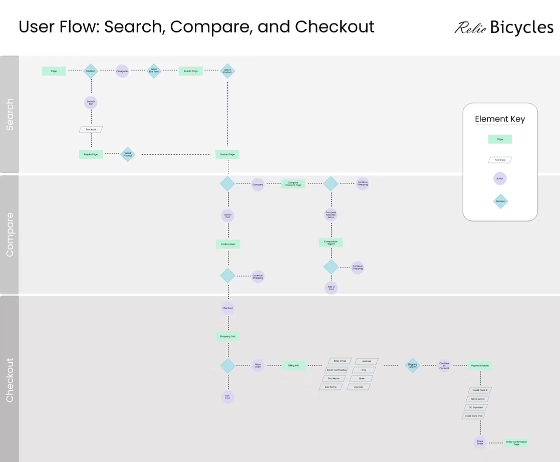
User Flows
I mapped user flows to visualize the customer journey and uncover mobile-specific pain points. By comparing current task flows with ideal user paths, I identified key bottlenecks in the purchase process and opportunities to streamline the purchase experience.
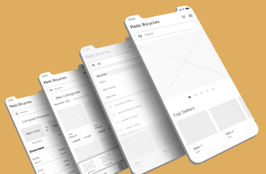
Wireframes
I started with low-fidelity wireframes to rapidly test and iterate on concepts without getting caught up in visual details. These wireframes were grounded in my user flows, competitive research, and interview insights, allowing me to quickly validate core navigation and layout ideas before moving to high-fidelity designs.
Guerilla Usability Testing
Details
- Ran 10 test sessions with local bike shop customers
- Mixed in-person interviews and remote screen-sharing sessions
- Clickable prototype testing with guided tasks
- Few guided tasks and questionnaires/usability interviews
- 20-30 minute sessions with post-test questionnaires
Findings
- 35% wanted more distinct comparison table labels
- 25% failed to complete checkout from the comparison page
- Users wanted more prominent product reviews
- Search functionality performed well overall
- Shipping information needs to be more visible throughout the site
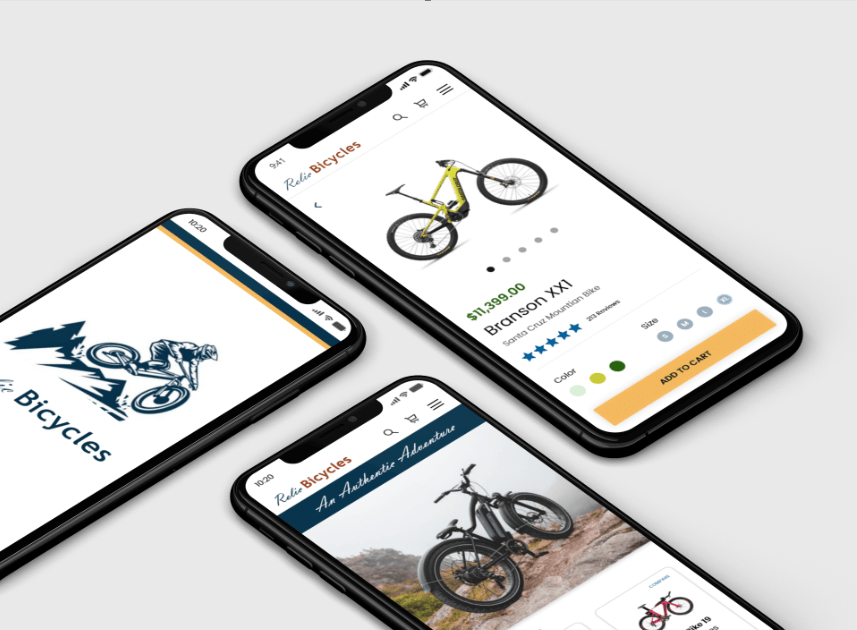
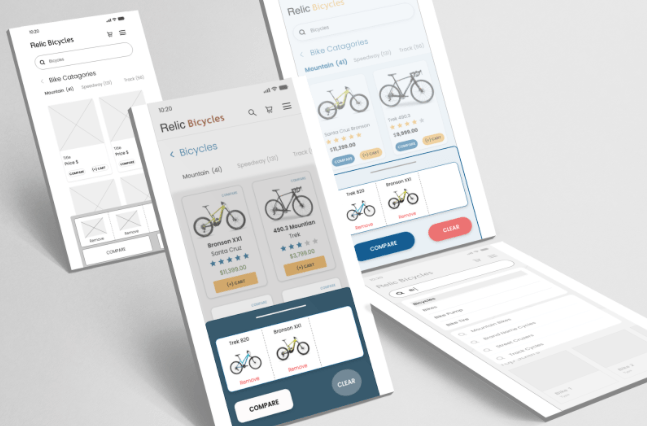
High Fidelity v1
Based on guerrilla testing insights, I refined the design and functionality choices before moving to high-fidelity prototypes. Within two weeks, I created the first round of polished screens, incorporating user feedback on search, navigation, comparison features, and the checkout flow.
1:1 Moderated Usability Testing
Details
- Remote testing via Zoom with 10 participants (6 male, 4 female)
- High-fidelity clickable prototype + user flow testing
- Goal: Validate design decisions and identify remaining usability issues
- Participants were recruited from my local bike shops customer base
Findings
- Users want regular order status updates throughout the process
- Shipping options need to be presented earlier in checkout
- Product comparison table needs clearer, more defined labels
- "Favorites" feature is expected by users familiar with ecommerce
- Some confusion around navigation, but overall task completion was successful
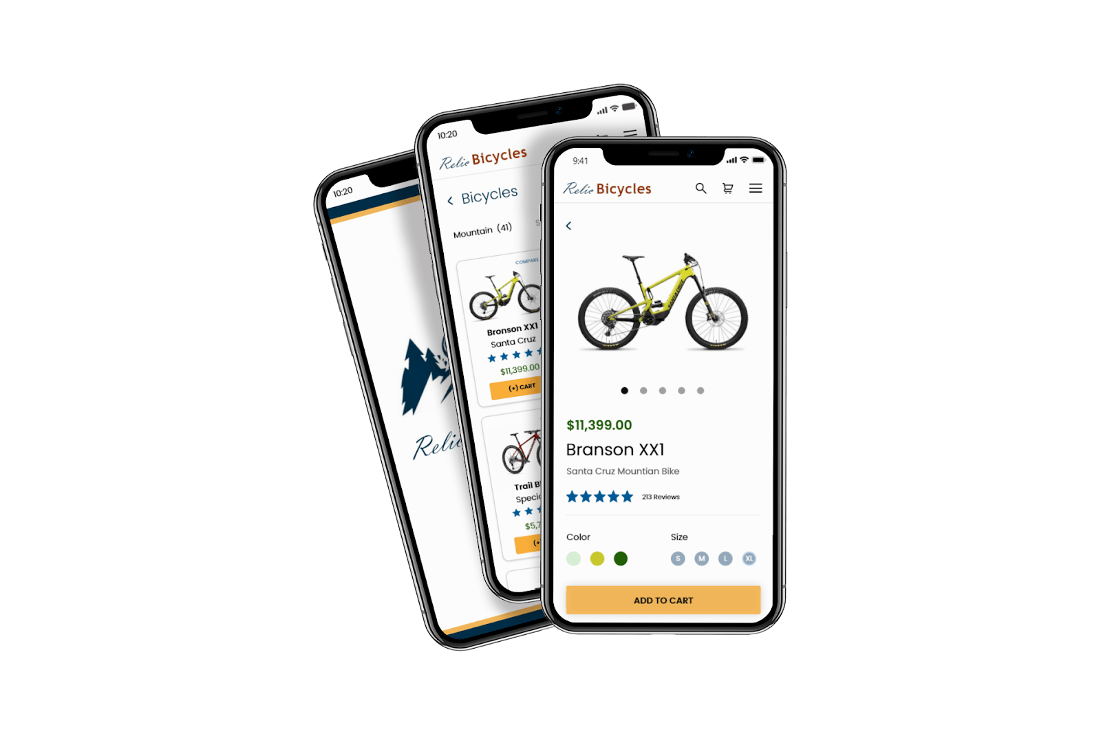
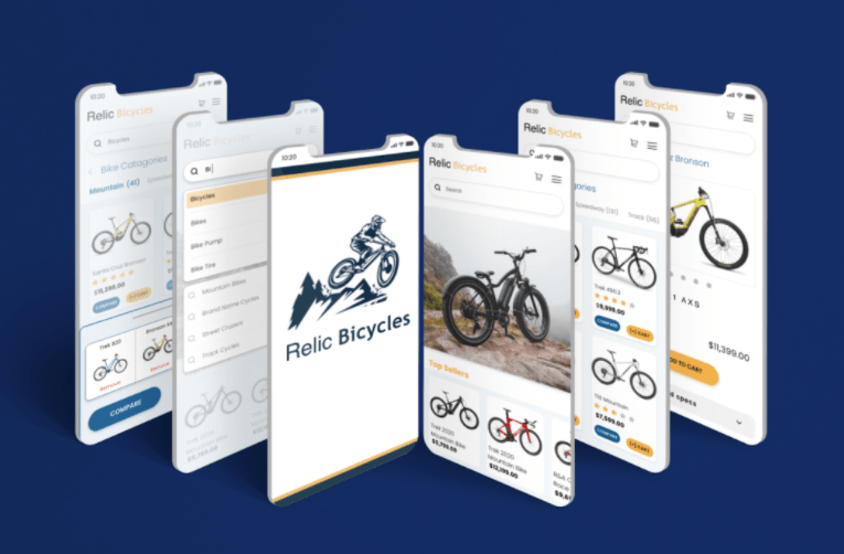
High Fidelity v2
After implementing user feedback from testing, I created a second iteration with refined branding, improved user flows, and additional features like enhanced product comparison and more prominent review displays
Collaboration and Implementation
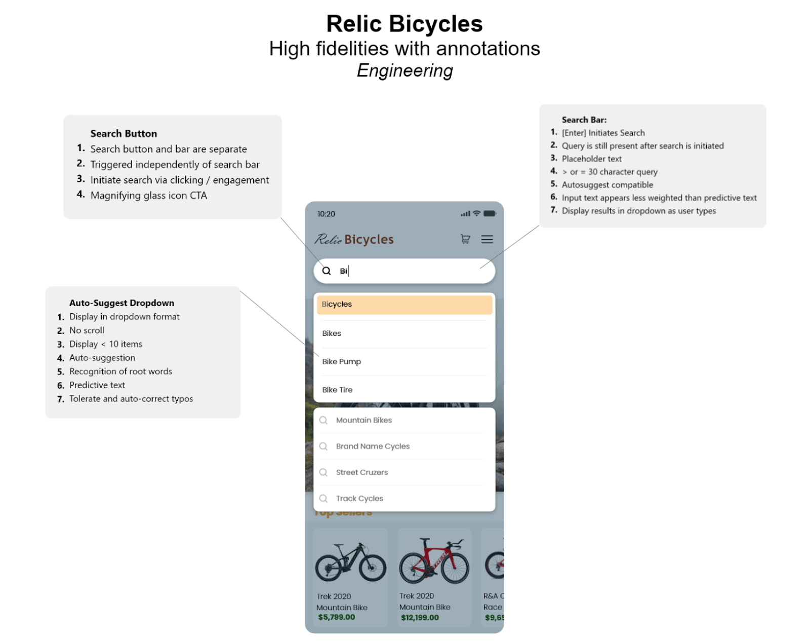
I worked closely with stakeholders throughout the project to balance business objectives with user needs. For implementation, I created detailed annotations and defined UI/UX behaviors to ensure smooth engineering handoff and an accurate + high-quality build.
Reflection & Impact
In a highly competitive market, poor UX can directly impact sales since usability often drives purchasing decisions. Through user-centric design and close collaboration with stakeholders, the redesigned mobile experience delivered measurable improvements:
- Intuitive search and product comparison features
- Clear CTAs and accessible product discovery
- Diverse payment options for high-value purchases
- 50% reduction in checkout flow screens
- 30% increase in search-to-purchase conversion
"Great UX isn't just about making things look good - it's about understanding user behavior and designing experiences that convert."
Key Project Reflection