Designing a Digital Museum Companion
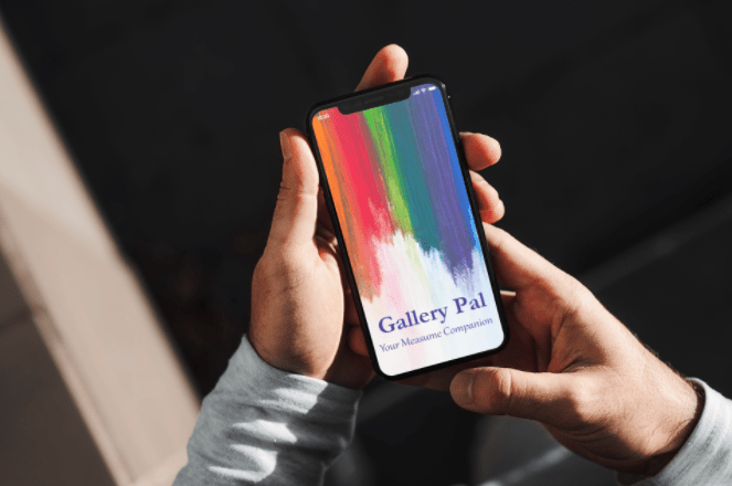
Gallery Pal is designed to transform how visitors experience art museums. Created during a 14-day Google Ventures style design sprint, this concept tackles the common frustrations of museum navigation through an intuitive digital guide that enhances the art viewing experience.
Key Challenges
Problem: Museum visitors consistently struggle with two core challenges: finding their way around large, complex spaces and connecting meaningfully with artwork beyond surface-level observation.
So what was happening?
- Wayfinding difficulties in large museum spaces with poor signage
- Information overload when faced with hundreds of artworks without guidance
- A lack of personalization in existing audio tour experiences
- Accessibility barriers for visitors with different needs and preferences
Design Opportunity:
How might we create a digital companion that guides visitors to art they'll love to enhance understanding without overwhelming them or detracting from the authentic museum experience?
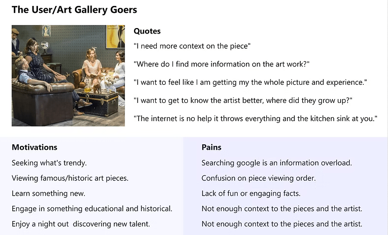
After reviewing the problem space and provided user insights, I created a quick persona outline to stay aligned with user motivations and challenges.
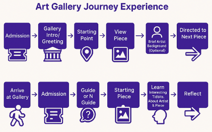
Journey Mapping
Mapping
User needs guided each step from admission to departure.
Curiosity
Visitors often arrive with little information.
Research
People rely on quick searches that provide limited context
Context
Info about provenance, techniques and expert insights.
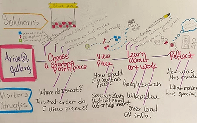
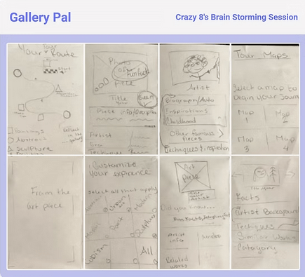
These are my notes from a brain storming session that was focused on outlining the typical user journey
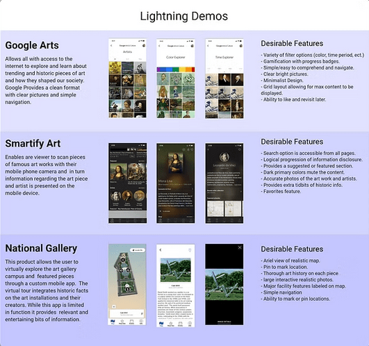
Lightning Demos
Secondary research into paintings, sculpture, and portraiture revealed new tools and insights, helping to shape a clearer market picture. I reviewed a dozen products and drew design inspiration from three key examples.
Sketching
Crazy Eight brainstorming activity helped generate and refine ideas, features, and concepts to shape a cohesive, clear interface. I often use this technique in group settings to help generate a variety of solutions in a short amount of time and all can be heard / contribute.
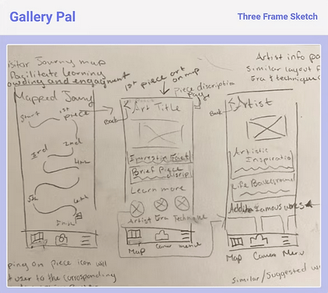
Next I jotted down a quick three-frame sketch to outline the core screens of the experience: a map, an art piece view, and artist information. The interactive map plays a key role, revealing rich details about the background of the art, the techniques used, and the era it was created in - the goal is to offer users a deeper and more engaging exploration.
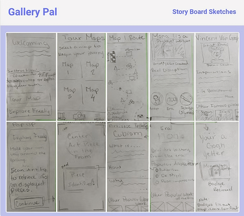
Storyboarding
I created guided experience sketches that turned into a map-like format, helping people to move through the art journey in a clear and engaging way. Storyboarding helped me plan the most important elements on each screen and made sure the experience felt cohesive and easy to follow.
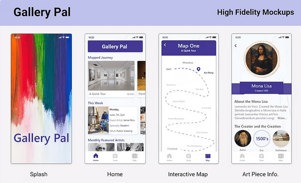
High Fidelity Designs
High-fidelity mock-ups were developed rapidly to bring the core experience to life, with navigation designed to prioritize ease of use. I focused on giving users quick access to the homepage, scan functionality, and the interactive map: pillars of the product's core value.
Through usability testing and feedback loops, I refined the layout to ensure clarity and consistency across screens. The visual design remained intentionally clean and understated to allow the artwork to take center stage, while still reflecting brand identity through the thoughtful use of typography, spacing, and color. This approach supported usability and aesthetic goals, balancing functional clarity with a refined, gallery-like feel.
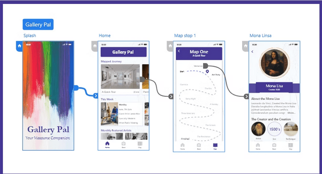
Prototyping and Animation
A high-fidelity prototype was created to demonstrate key flows and reroutes, with animations added to illustrate interaction patterns and enhance usability. I used progressive disclosure to reveal historical context and artist insights at the right moments, keeping the experience both informative and focused. The prototype allowed me to explore design decisions and reflect on how motion and flow impact user engagement.
Usability Testing
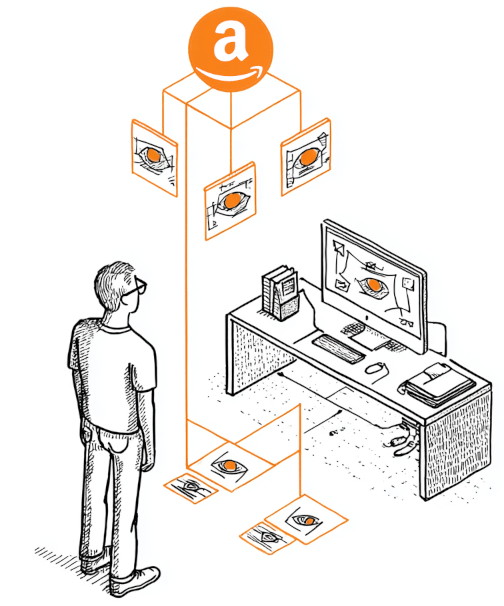
Testing Details: To evaluate the prototype, I conducted unmoderated remote usability testing using Amazon Mechanical Turk. This approach allowed me to quickly gather diverse feedback from a wide range of users in a short time throughtask-based usability testing focused on flow, navigation, and content clarity.
A key takeaway was that users were eager to explore all areas of the experience, highlighting the need for deeper and more intuitive navigation. Feedback was positive - users appreciated the visual guidance and contextual information. Comments like "What a nice guide to have during a museum visit" and "I like the context that the artist's background provides" reinforced the value of combining educational content with accessible design.
Findings:
- A larger, more interactive map would improve user engagement and ease of use.
- All users completed the tasks successfully, offering insights into which elements to refine, enhance, or potentially remove.
- Users responded well to visual cues but needed clearer indicators for interactive elements.
Iterated High-Fidelity Designs
Based on usability insights, I refined the high-fidelity designs to better align with user behavior. The interactive map was expanded for easier navigation, and visual cues were improved to make interactive elements more obvious. I also reorganized content to support deeper exploration without adding friction. These updates made the experience more intuitive and engaging while preserving the clean, gallery-inspired aesthetic.
Reflection & Impact
The Gallery Pal concept lays a strong foundation for a thoughtful and engaging gallery companion app. It introduces key features and a clear user flow, but future iterations will focus on refining the information architecture, enhancing usability through further testing, and improving screen-level clarity.
Creating this quickly was an exciting challenge that pushed my rapid prototyping and research skills. I enjoyed designing a product that makes culture more accessible and helps connect people with art. This process deepened my commitment to user-centered design and highlighted the value of ongoing iteration and feedback.
"Gallery Pal taught me how rapid, user-centered design can meaningfully connect people to culture through thoughtful, accessible experiences."
Key Project Reflection
Wins
Validated design direction through real user feedback.
Challenges
Balancing depth of content with simple navigation.
Future Focus
Refine IA and expand usability testing with interviews.